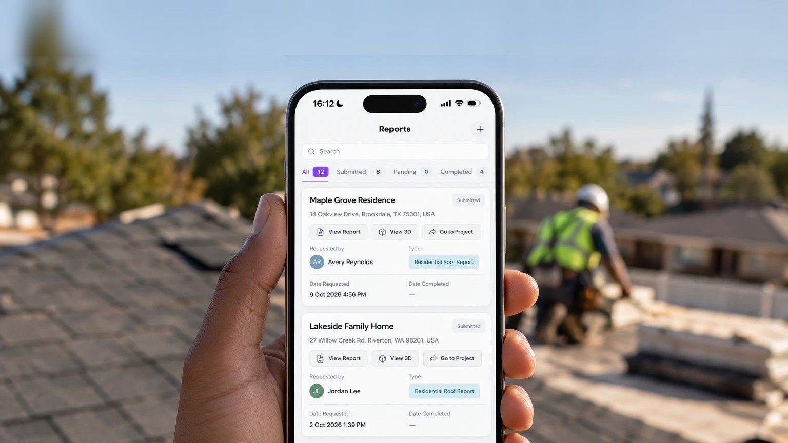
Great on-site. Lost at the office.
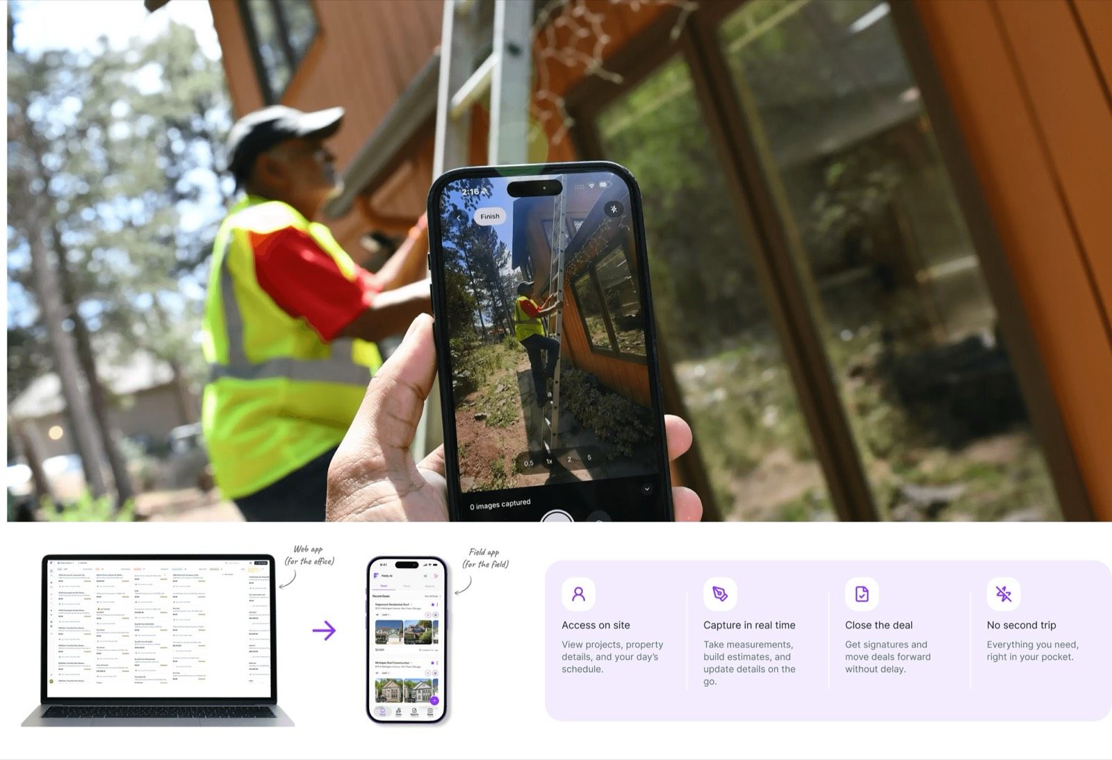
Feldy had been a desktop web app for three years. It worked for the office, not the field. Contractors walk properties and talk to homeowners all day, but a measurement, an estimate or a signature meant going back to a desk. The gap between “the homeowner is ready” and “the paperwork is ready” is where jobs slipped away, and support kept hearing it in tickets and emails.
There was a business case too. Measurements was the web app feature customers kept coming back to, and doing it on-site means more reports: more money for contractors and for Feldy. No tool on the market covered the whole visit, and leadership wanted the Field App to be the one contractors reach for on every job.
The brief: turn one property visit into a signed deal, with no second trip.
Secondhand signal, firsthand review.
Research was lean. I worked from what support and leadership heard every day and customer emails shared in Slack, audited four field and CRM tools across the same site visit, and put my first concept in front of leadership.
| Site photos | 3D measurement | Quote on-site | Close on-site | Deal pipeline | |
|---|---|---|---|---|---|
| CompanyCam | Core strength | No | No | No | No |
| Jobber | No | No | Yes | No, approved later online | No |
| Hover | No | Core strength | No | No | No |
| Attio | No | No | No | No | Core strength, desktop-first |
| Feldy Field App | Yes | Yes | Yes | Yes | Yes, rebuilt for mobile |
What each tool is built around. ✕ means it isn’t that tool’s focus.
The insight was workflow fragmentation: each tool covers one part of the visit, so contractors juggle several apps. Feldy could put the whole visit in one.
Every signal was secondhand, and that’s the first thing I’d change. After launch, real usage took over: support tickets drove the Create New Deal redesign (section 08).
This was never a resize job.
I went in assuming I’d fit the web app onto a phone, and my first concept, V1, did exactly that. It failed concept review: all those features on a small screen were cluttered and too much to take in on-site. The field app had to work for someone in a driveway, one hand on a phone, mid-conversation with a homeowner who’s ready to sign. So I rebuilt every flow mobile-first.
Same features. Completely different interaction model.
The home screen: no Kanban board on a phone
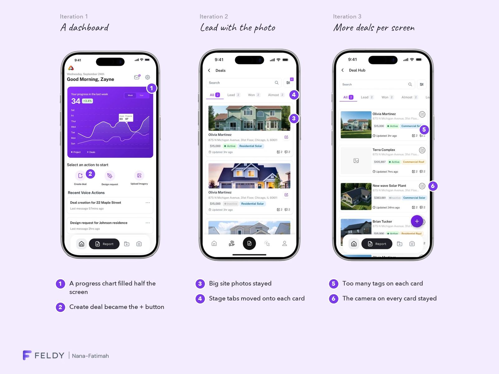
On desktop, home was a Kanban pipeline: columns of deals by stage, each showing a name but no photo. That needs a wide screen, so I started over. It took three iterations, each based on the web app and how customers used it.
- Iteration 1: a dashboard. My own assumption, not from the web app: a progress chart filled half the screen and deals weren’t there at all. Contractors open the app to see their deals, so it went.
- Iteration 2: lead with the photo. Big site photos let contractors recognise a job by the house. That stayed; the desktop-style stage tabs and unlabelled icons didn’t.
- Iteration 3: fit more deals. Compact cards carried too many tags, and some got cut off.
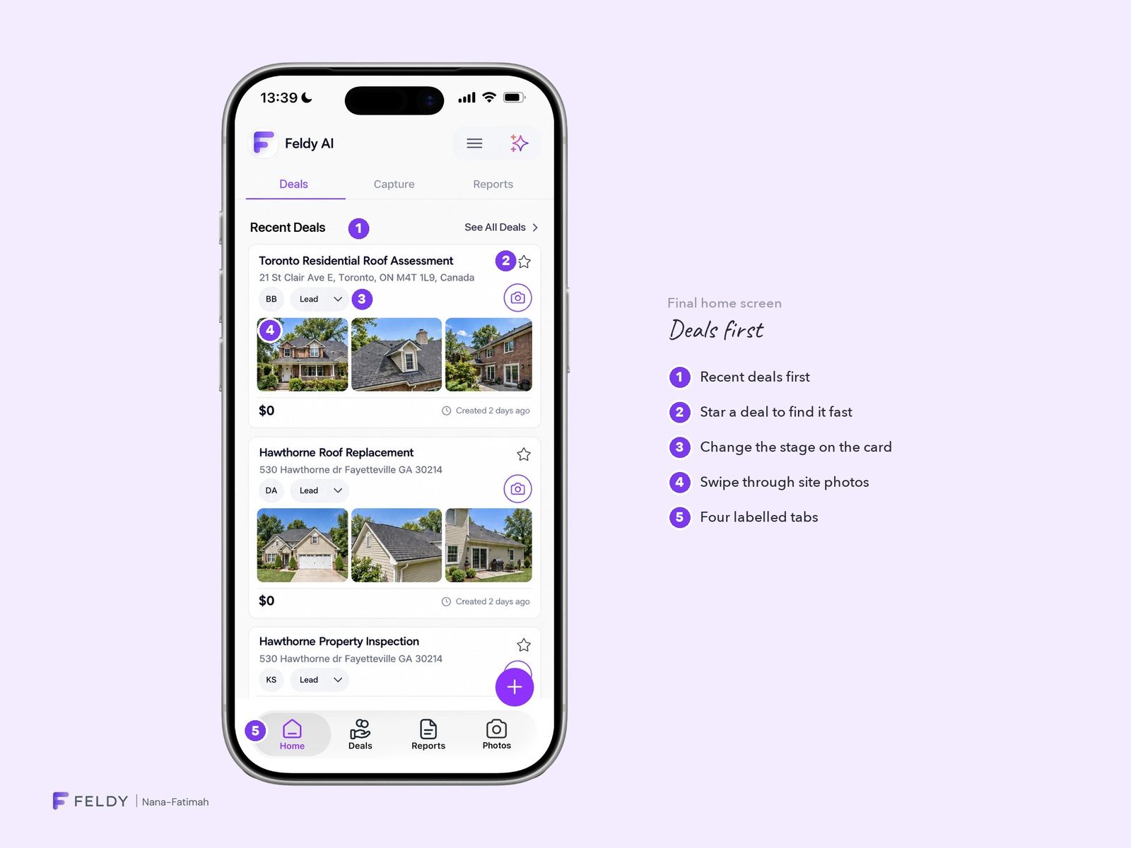
The final home puts deals first. Recent deals lead with a swipeable photo strip and only what a contractor needs: address, stage, value and date. The stage changes right on the card, a star keeps key deals close, and the navigation has four labelled tabs.
The deal page: from information to action
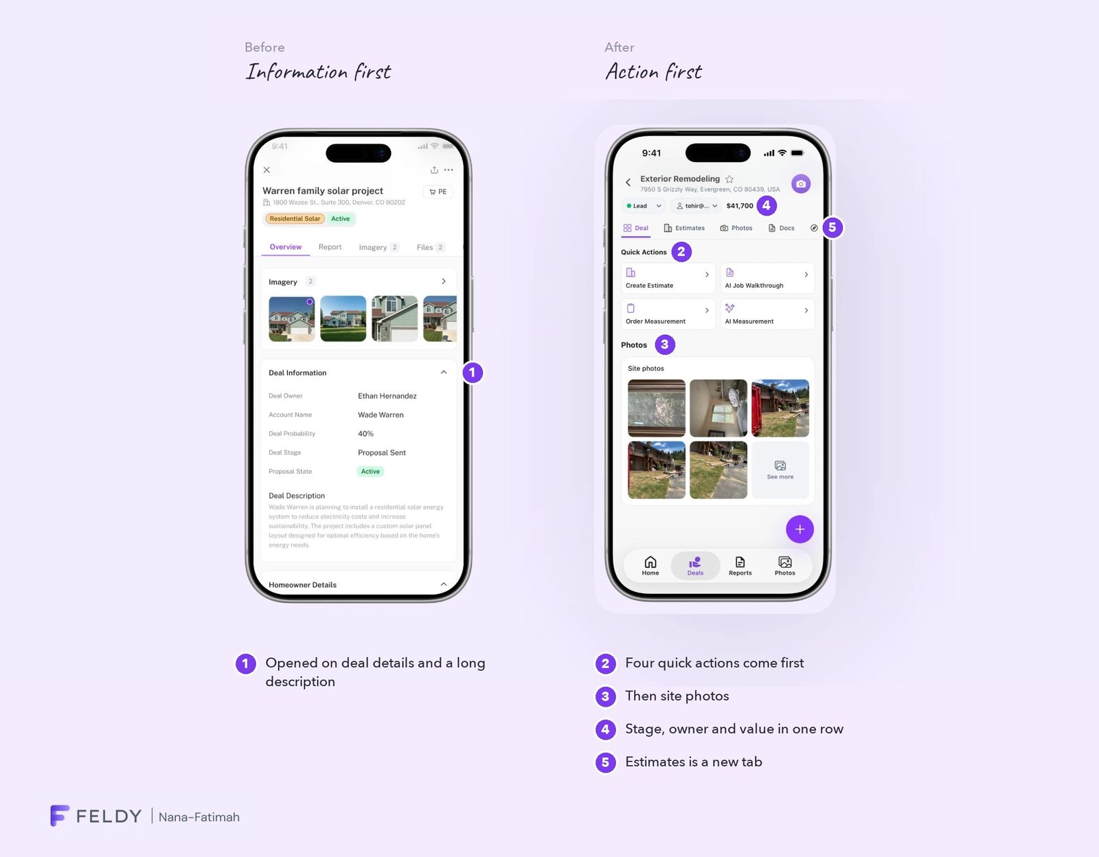
The first deal page followed the web app and opened on information: owner, probability, a long description, homeowner details. On-site, a contractor opens a deal to do something.
On almost every deal, they do one of four things: create an estimate, run an AI job walkthrough, order a measurement or run an AI measurement. Those quick actions now come first, then site photos. Stage, owner and value sit in one row under the title, and Estimates, a new feature, is a swipe away.
Lead designer, with a clear split.
I owned the information architecture, the deals home, photos, measurement reports, the AI Job Walkthrough and files. Godson Jr. owned estimates and documents. I worked with Zayne Sagar (CEO) on direction and Tohir Babatunde (front-end) through handoff and build.
Turning a site visit into usable data.
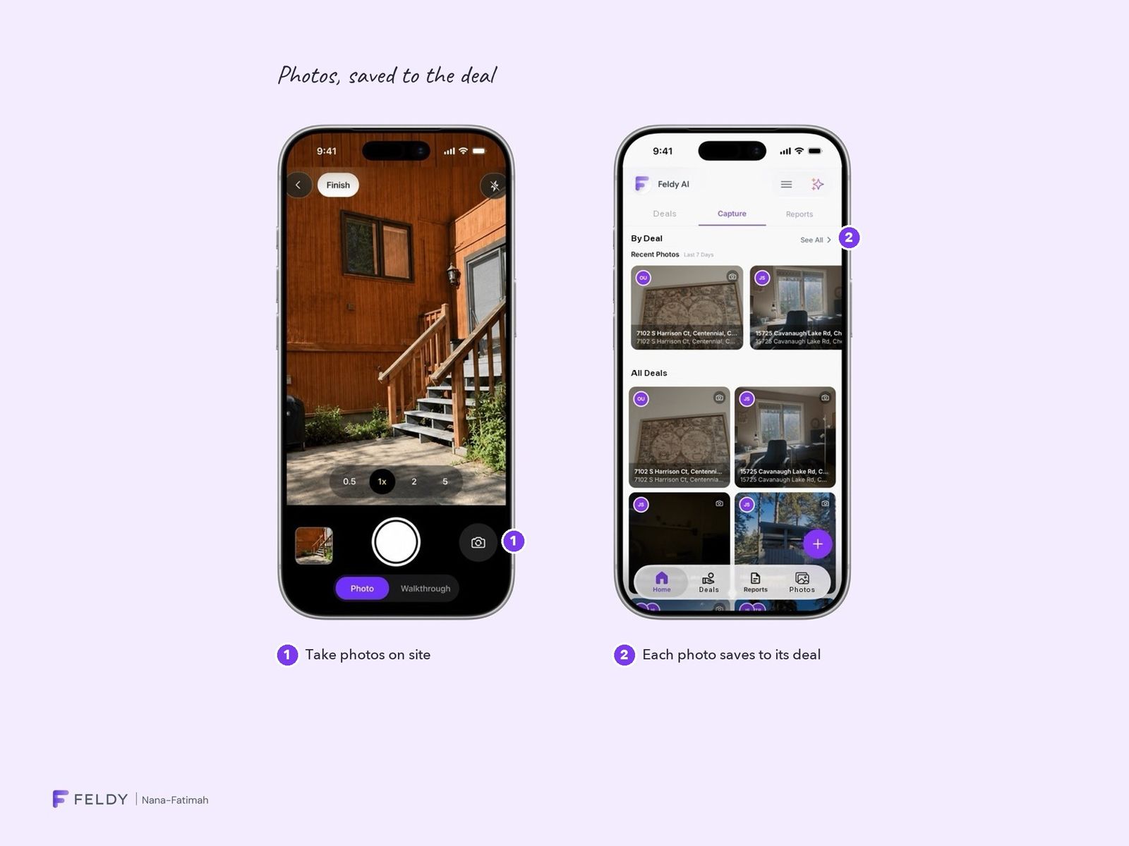
- Photos organised by deal. Every photo saves to the right deal the moment it’s taken, so nothing gets lost in the camera roll.
- AI Job Walkthrough. Typing on a roof is slow; talking isn’t. So instead of a notes field with voice as an extra, voice is the main input. Contractors talk through the property, then review and edit the transcript. The AI types; the contractor decides what’s saved.
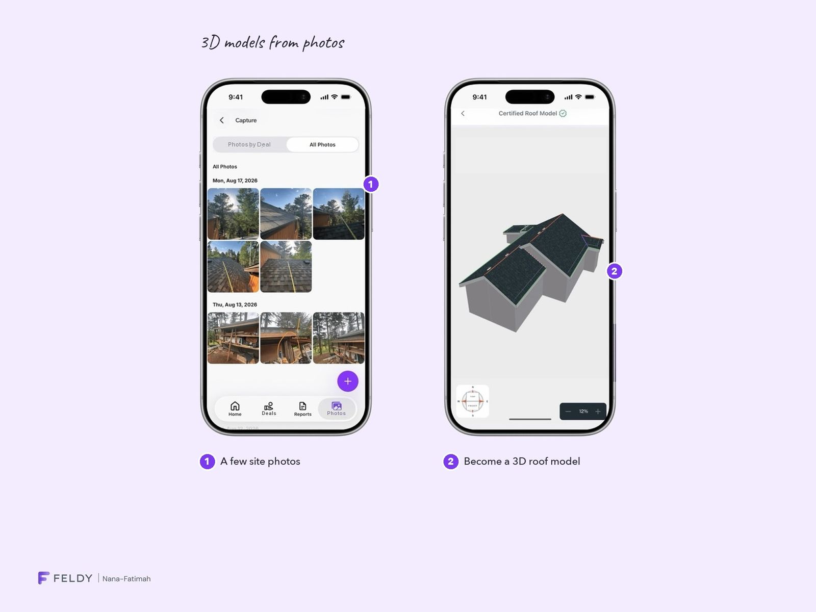
- Measurements from photos. A handful of site photos produce a 3D model and a report to quote from straight away.
Close the deal before leaving the driveway.
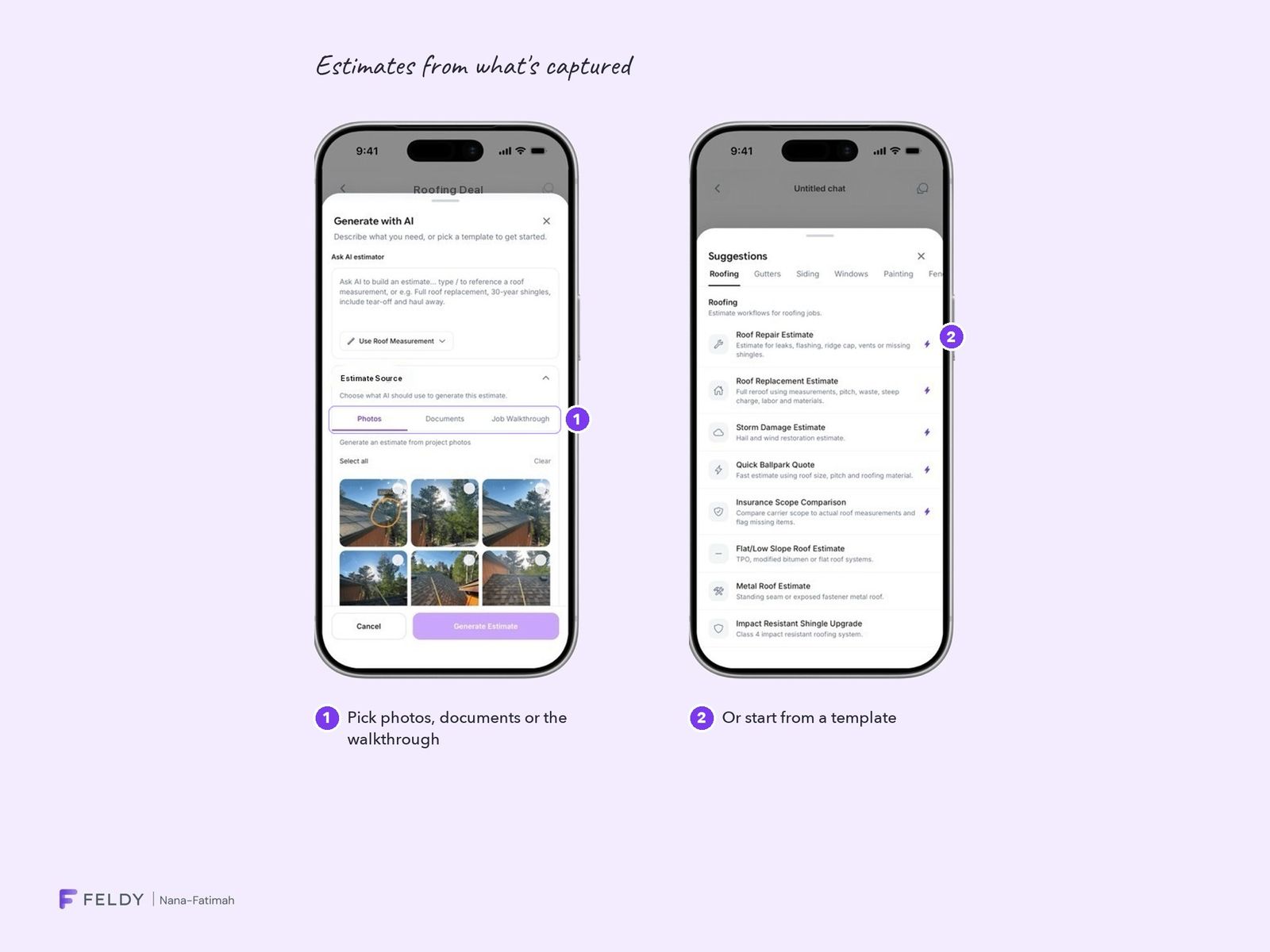
Estimates, Godson’s area, are built from what contractors already captured in my flows: photos, walkthrough notes and the measurement report. Nothing gets re-entered.
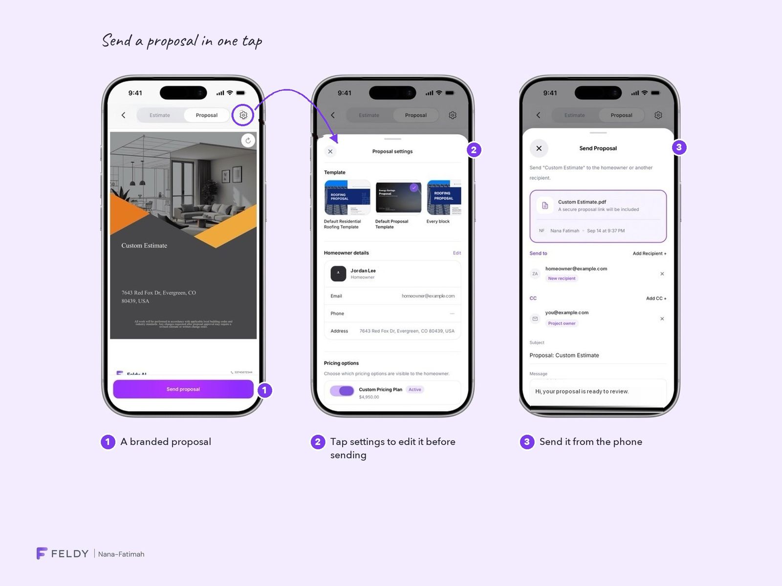
On one visit, a contractor can open the measurement report, generate an estimate with their own pricing, adjust it with the homeowner, send a branded proposal in one tap and collect a signature. Every step existed on desktop, but back at the office. Now they can happen in the same visit.
Scoping for a launch date.
A fixed launch date meant two trade-offs. We scoped the MVP to deals, photos and reports and deferred scheduling to V2. And instead of an AI button on every deal card, which would have taken far longer to build, we shipped one central AI button that works across the app.
Live, early, and already learning.
The Field App is live on iOS and Android (App Store) in early access, with fewer than 100 users. The numbers are small, but feedback has already changed the product.
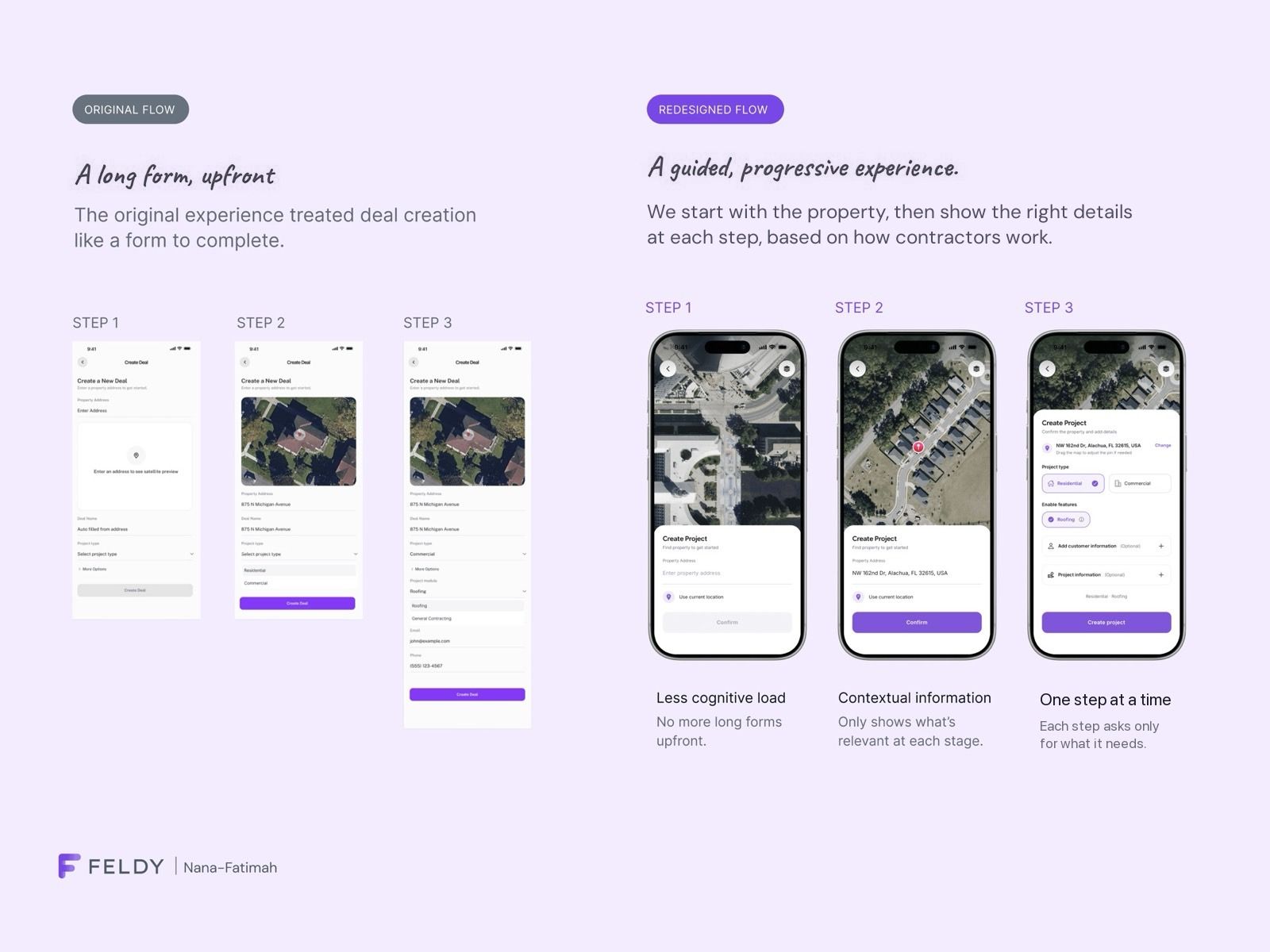
Customers found Create New Deal unintuitive: it front-loaded a long form. The redesign starts with the property on a map, then asks only for what matters at each step.
What I’d do differently.
We moved fast and didn’t validate enough. Most testing was internal or with customers already reporting issues, which shows what’s broken, not what’s working. Next time I’d test with contractors outside the support queue and agree success metrics before launch.