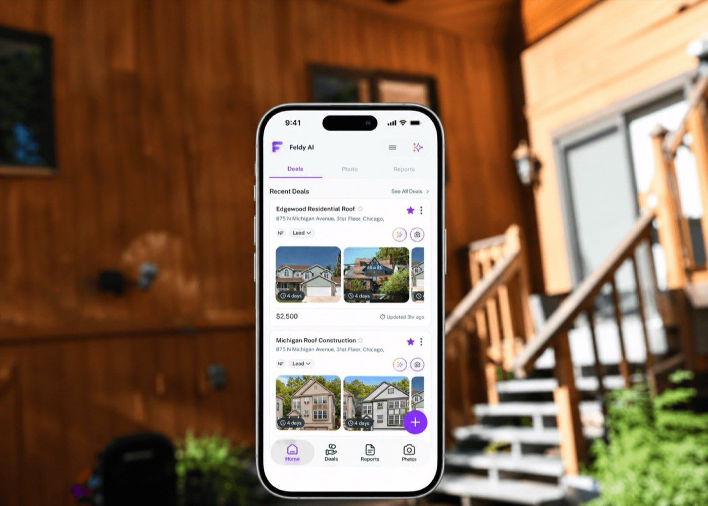
Fast healthcare, on a slow channel.
Clafiya connects patients with community healthcare workers for fast, affordable care across Africa. When I joined the project, the whole service ran on USSD.
Over six weeks as UX/UI designer and researcher, my job was to work out how to extend Clafiya’s reach beyond what a USSD menu could carry, without walking away from USSD itself.
USSD was the door. It was also the wall.
- The USSD code was hard to remember
- Poor network feedback made people abandon requests halfway
- Patients had no way to look back at their own health records
- The whole flow was slow, which worked against Clafiya’s promise of fast care
We couldn’t just fix USSD’s interface, because the slowness was structural. And we couldn’t drop it, because it was still the only way in for many of Clafiya’s users.
An interface problem became an access problem.
We ran user testing to see exactly where people dropped off, a competitive analysis of similar healthcare platforms and empathy mapping to understand the frustration behind the drop-off. Then we checked whether a digital alternative was realistic for enough people.
That last piece changed the direction. Mobile internet reach was high enough to make a smartphone app a real option, but not high enough to make USSD replaceable.
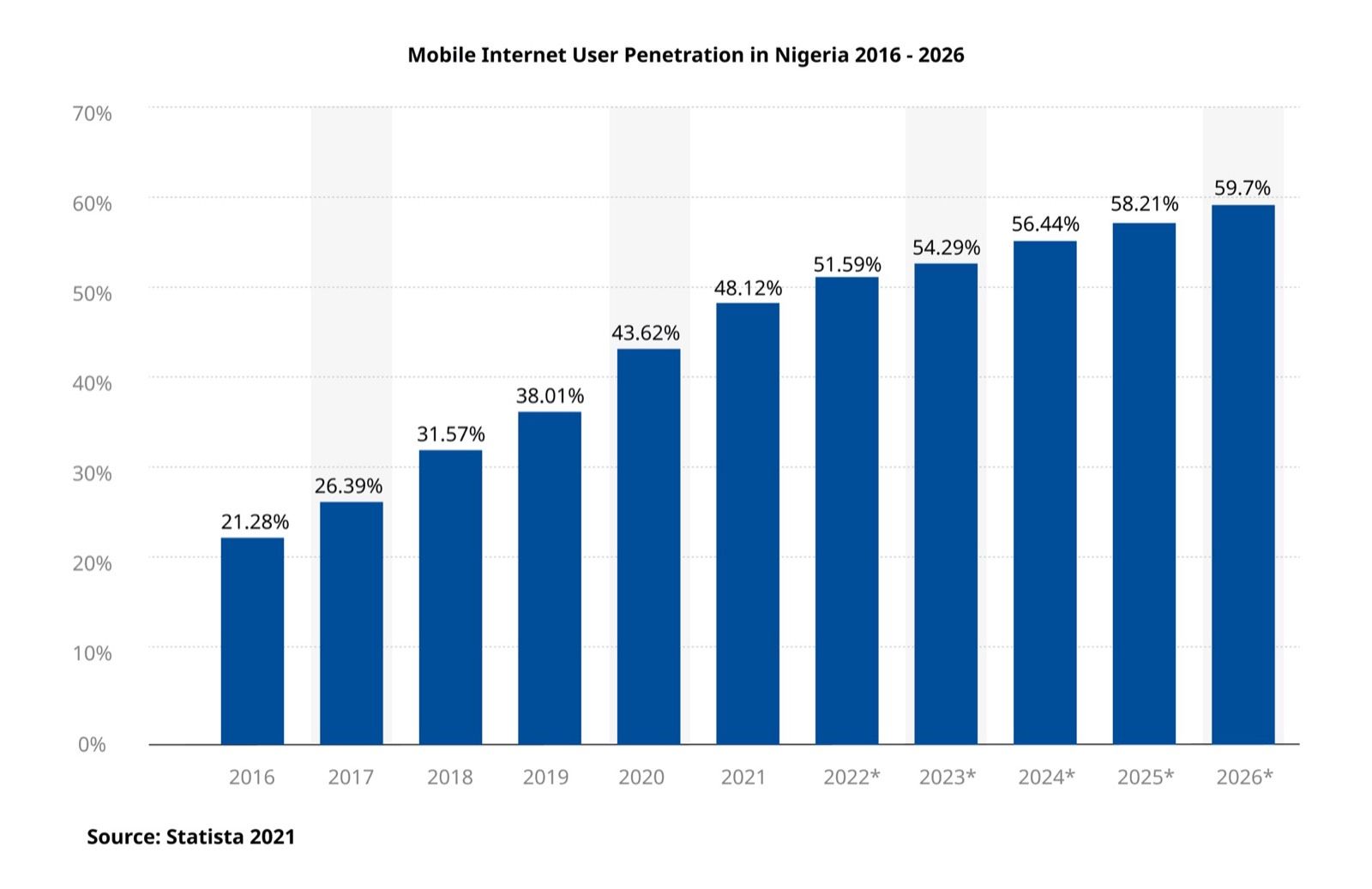
Don’t pick one channel. Give people more than one door.
Four ways in, one Clafiya.
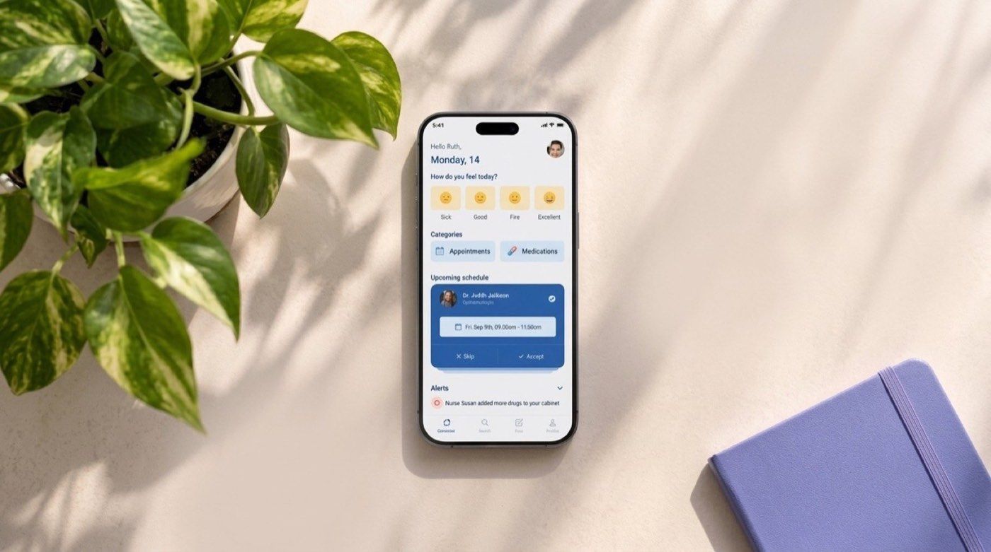
- A mobile app for people with reliable smartphones. It carries what USSD can’t: visuals, a browsable interface, reminders, education and a personal medical history.
- USSD stays as the universal fallback that works on any phone.
- A memorable speed-dial number, so reaching Clafiya doesn’t depend on remembering a code.
- A simple branded device for urgent cases where waiting on the network isn’t acceptable.
We also recommended strengthening the healthcare worker network and support team, because a better app can’t fix a slow response on the other end.
Worth switching to.
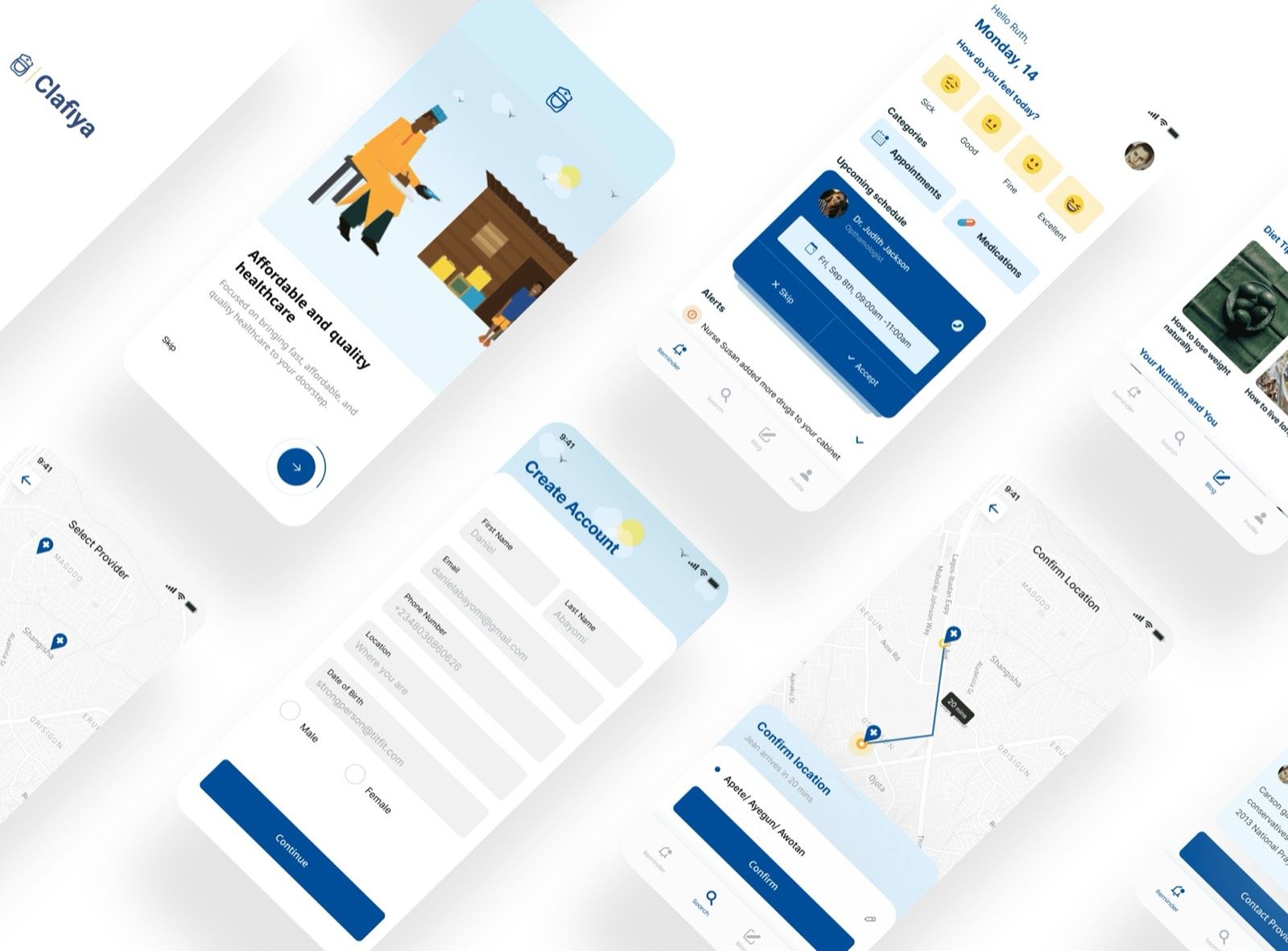
The app was competing with a channel that asks for zero commitment, so it had to earn the switch.
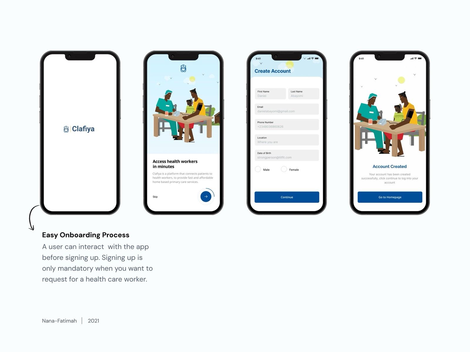
- Explore before signing up. Onboarding lets new users look around first.
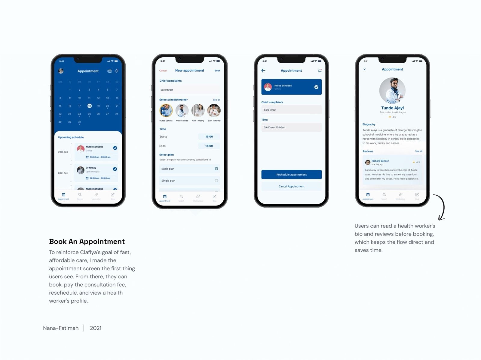
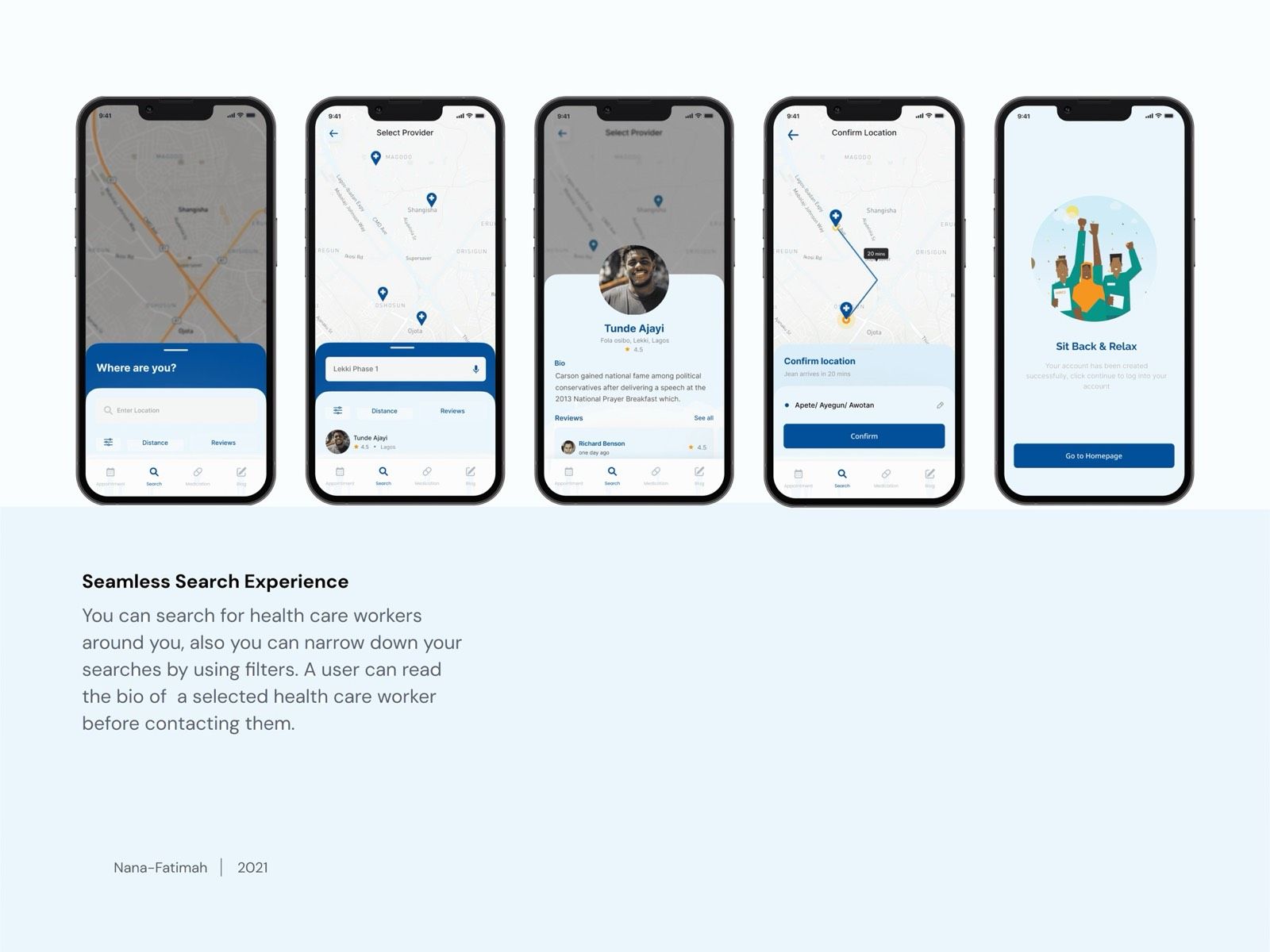
- Booking that feels like browsing. Read a health worker’s profile and reviews, then book directly, with search and filters.
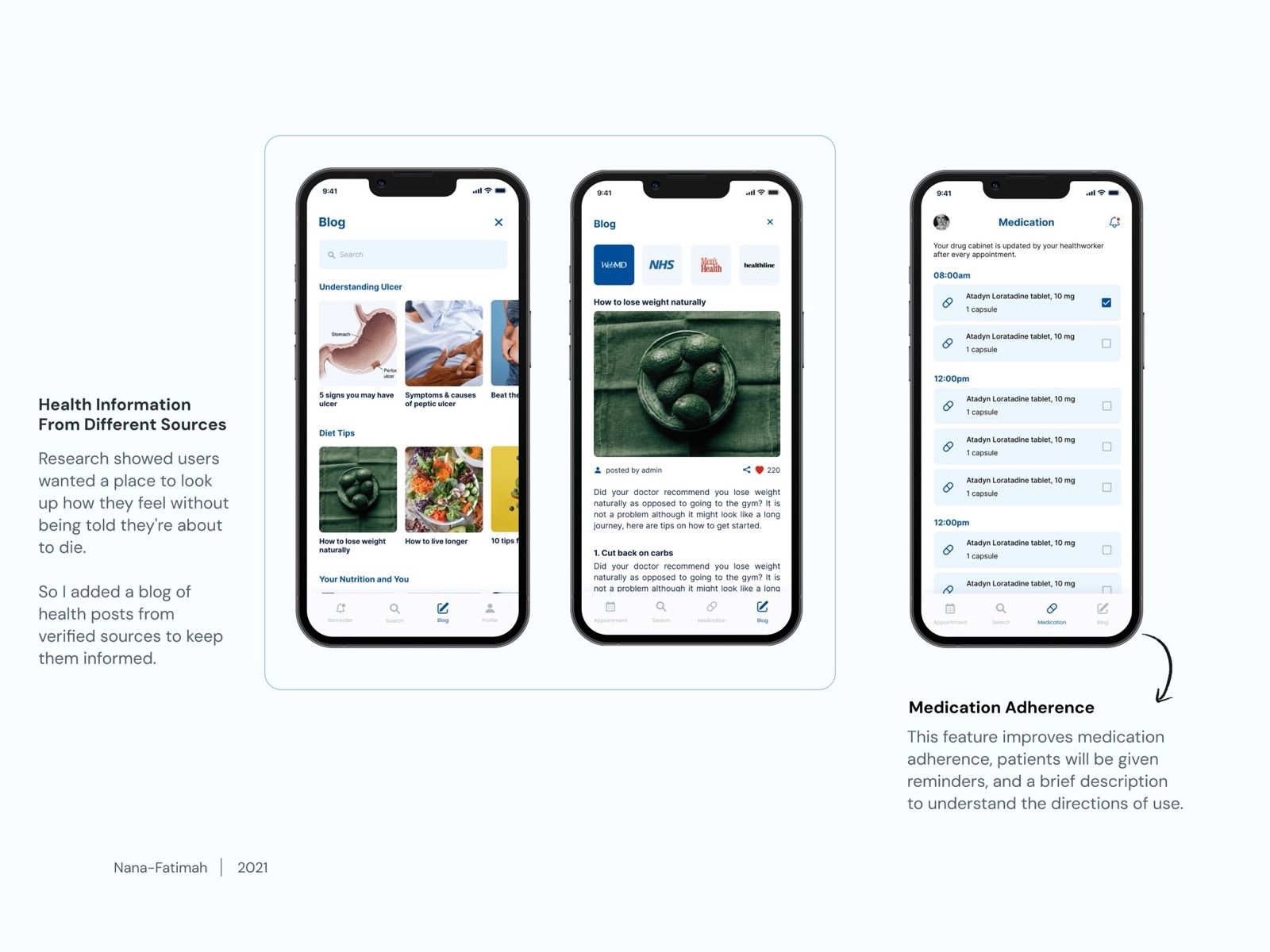
- Care beyond the appointment. Medication reminders, a hub of verified health articles and flexible plan pricing.
- One profile for appointments, alerts and a wallet, instead of scattered flows.
Six weeks, four access points.
Six weeks to go from research to a hybrid system and a full app design. The app got the deepest design work. The speed-dial number and hardware stayed at the level of validated concepts, which is honest for the time we had.
A direction that added, not replaced.
This was a direction, not a shipped and measured product. USSD stays as the fallback, the app carries the deeper experience, and speed dial and hardware cover the gap in between.
The best sign it held up: it never asked Clafiya to abandon the one channel that already worked for their hardest-to-reach users. It asked them to add to it.